header-logo

CODE WITH FAHIM

CSS Box-Sizing


🧠 The Core Concept:

Every element on a webpage is like a little rectangular “box.”
That box is made up of four layers:

1.Content → the text or image inside.
2.Padding → the space between the content and the border.
3.Border → the outline surrounding the padding.
4.Margin → the space outside the box, separating it from other boxes.
So, when you set:

width: 300px;
height: 200px;


you’re talking about the content box — unless you change box-sizing.


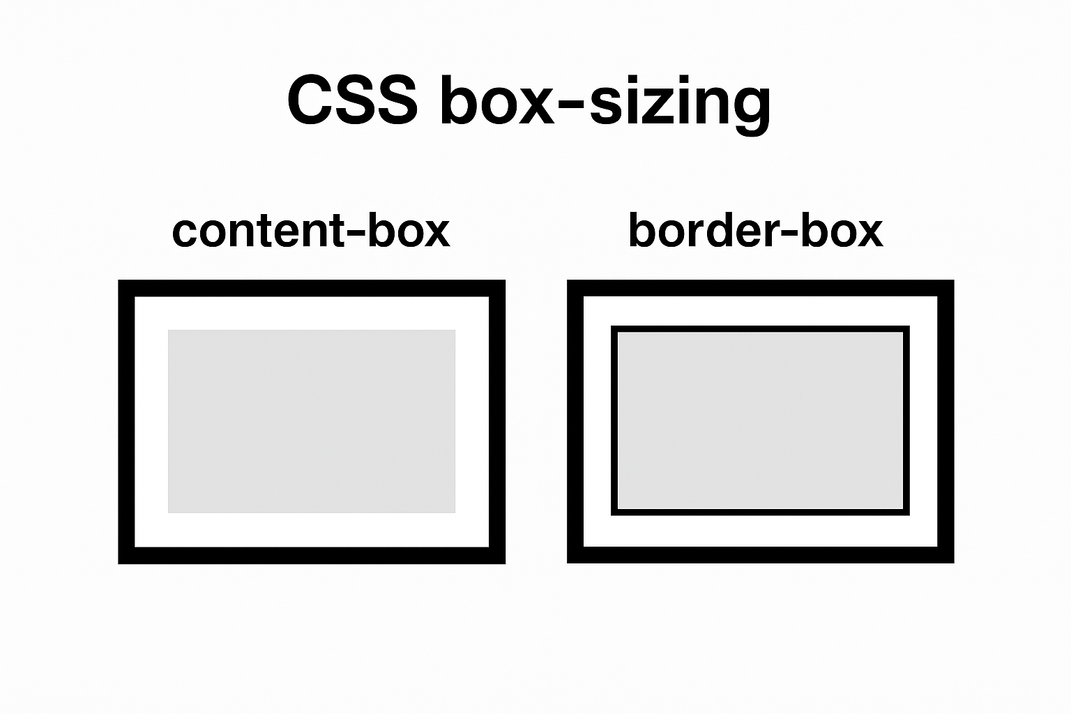
⚙️ The box-sizing Property Values:

1. content-box (default):

Think of this as the “old-school” box model.


.box1 {
box-sizing: content-box;
width: 300px;
padding: 20px;
border: 10px solid #333;
}


🧮 Total Width = 300 + (20×2) + (10×2) = 360px.


2.Border box(modern standard):

This one’s way more practical for layout design.


.box2 {
box-sizing: border-box;
width: 300px;
padding: 20px;
border: 10px solid #333;
}


🧮 Total Width = exactly 300px, no matter what padding or border you add.


3.inherit:

This makes the element take the box-sizing value from its parent.

.child {
box-sizing: inherit;
}


This can be useful when you’re building complex UI systems or CSS frameworks where inheritance keeps things consistent.


🌍 Best Practice (Developers’ Favorite Trick):

Nearly all modern projects start with this reset:

*{
box-sizing: border-box;
}


✅ This ensures every element, including pseudo-elements, behaves predictably.
✅ It prevents weird overflow bugs caused by padding or borders.


📊 Quick Visual Comparison:

Property content-box(default) border-box(modern)
Width includes Content only Content + Padding + Border
Easier to size ❌ No ✅ Yes
Default in CSS ✅ Yes ❌ No
Common in use ⚙️ Legacy layouts 💪 Modern responsive layouts


🧩 Why box-sizing matters:

Imagine building a grid of perfectly aligned boxes — cards, buttons, or input fields — and suddenly some are wider because of padding or borders. That’s a layout nightmare 😅.
box-sizing: border-box; fixes that by making the total size of each element predictable. You say “200px wide,” and it stays 200px, no matter what padding or border you add.

🧭 Designer’s Tip:

If you ever notice scrollbars appearing unexpectedly, it’s often because you’re using content-box and your padding or border pushed the box past 100% width. Switching to border-box usually resolves it cleanly.


box-sizing [7 to 12] [25 to 30]