🚀 Flexbox:
Flexbox—short for Flexible Box Layout—is basically CSS saying:
“Yo, arranging elements shouldn’t feel like solving a Rubik’s cube blindfolded.”
It’s a layout system designed to make items align, distribute, and resize smoothly inside a container, no matter the screen size. Think of it like the project manager of your webpage elements—keeps everyone in line, keeps the vibes consistent, and adapts when chaos hits.
🔥 Why Flexbox is a Big Deal:
- Responsive by design – items auto-adjust like they’re trained for a corporate crisis.
- Vertical & horizontal alignment –center things with one line. Absolute W.
- Controls spacing easily –no more margin hacks from the stone age
- Reorders items –without changing the HTML. Pure sorcery.
Flexbox isn’t just a layout tool; it’s the Beyoncé of CSS layouts — powerful, flexible, and low-key carries the entire front-end department on its back.
🧱 How It Works:
You take a container and declare it:
.container {
display: flex;
}
Boom—everything inside becomes a flex item that follows flex rules.
🧭 Core Concepts:
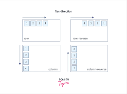
- flex-direction: row, column, row-reverse, column-reverse
-
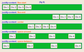
justify-content: aligns items horizontally
-
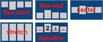
align-items: aligns items vertically
-
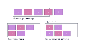
flex-wrap: allows items to move into multiple lines
-
gap: spacing between items (finally, a civilized solution)
The Deep Dive:
🧭 1. The Axes (The backbone of Flexbox):
Flexbox has two invisible axes:
➡️ Main Axis
The direction your items flow.
Controlled by flex-direction.
⬆️ Cross Axis
The axis perpendicular to the main one.
Controlled by alignment properties.
Think of them like highway lanes; they decide how the traffic moves.
🎮 2. Main Flexbox Properties (The ones you’ll use daily):
flex-direction:
Decides the direction items want to chill in.
flex-direction: row; /* default */
flex-direction: row-reverse;
flex-direction: column;
flex-direction: column-reverse;
justify-content:
Aligns items along the main axis (horizontal by default).
justify-content: center;
justify-content: space-between;
justify-content: space-around;
justify-content: space-evenly;
align-items:
Aligns items along the cross-axis.
align-items: center;
align-items: flex-start;
align-items: flex-end;
align-items: stretch; /* default */
 🌀 3. Flex-Wrap (Say goodbye to overflow chaos):
Items automatically move to the next row like they’re evacuating a crowded elevator.
flex-wrap: wrap;
flex-wrap: nowrap; /* default */
flex-wrap: wrap-reverse;
🔗 4. Gap (The underrated legend):
Finally, a way to add spacing between items without falling into margin madness.
gap: 20px;
Tips for centering ANYTHING (The Holy Grail):
.parent {
display: flex;
justify-content: center;
align-items: center;
}