🌐 What is CSS Grid?
Picture a spreadsheet… but for your website layout.
CSS Grid is a two-dimensional layout system that lets you control rows + columns at the same time.
It’s like Flexbox’s older, more structured sibling — the one who shows up to office meetings with a neatly colour-coded planner.
With Grid, you can:
-
Place items exactly where you want
-
Create rows and columns in seconds
-
Build complex layouts that stay responsive
-
Stop fighting with floats, positions, or hacks from 2010 😭
🪄 Why Grid is goated:
-
Perfect for full page layouts
-
Rows + columns = ultimate control
-
Less CSS, more power
-
Cleaner than Flexbox for complex layouts
-
Makes you look like you know what you’re doing even when you don’t
🧱 Basic CSS Grid Syntax:
1. Turn on Grid-
This is how you activate the grid layout system on any container:
.container {
display: grid;
}
Boom. You're officially in Grid mode.
2.Define Columns-
You decide how many columns your layout needs:
.container {
display: grid;
grid-template-columns: 200px 1fr 200px;
}
-
First column: 200px
-
Middle: flexible
-
Last: 200px
3. Define Rows-
Same idea for rows:
grid-template-rows: 100px auto 50px;
4. Add Spacing Between Items-
Because nobody likes elements hugging too close:
gap: 20px; /* both row + column */
row-gap: 10px; /* only rows */
column-gap: 30px; /* only columns */
5. Place Items-
Tell an item where to sit:
.item1 {
grid-column: 1 / 3; /* spans from column 1 to 3 */
grid-row: 1 / 2;
}
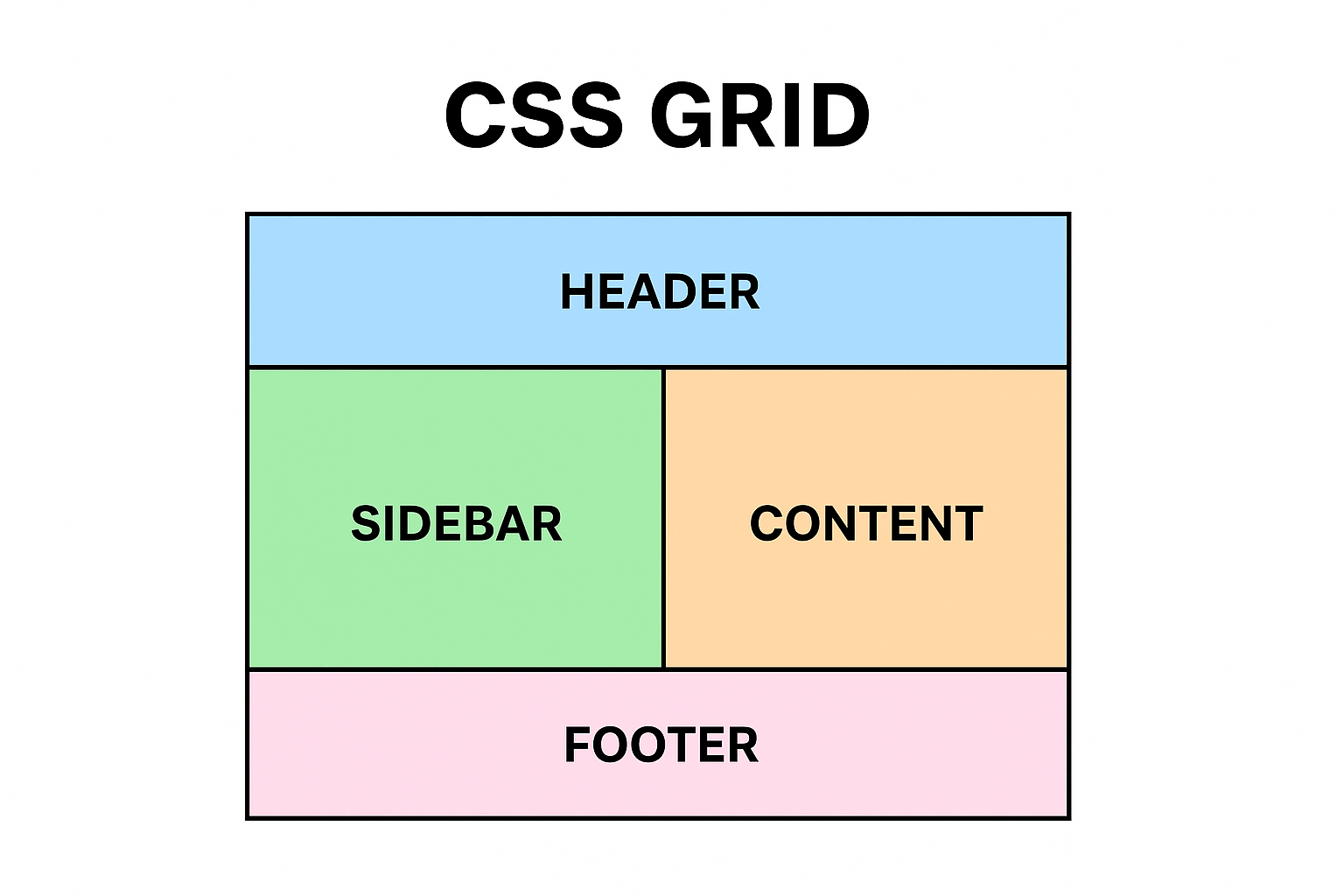
6. Grid Areas (Optional but Fire)
Name your zones to keep layout clean:
grid-template-areas:
"header header header"
"sidebar content content"
"footer footer footer";
Assign area:
.header { grid-area: header; }
7. Responsive Magic-
grid-template-columns: repeat(auto-fit, minmax(200px, 1fr));
⚔️ CSS Grid vs Flexbox —
Both are powerful. Both are modern.
But they’re built for different missions — like two cousins who pull up with different skill sets.
| Feature |
CSS Grid |
CSS Flexbox |
| Layout Type |
Two-dimensional (rows + columns) |
One-dimensional (rows or columns) |
| Main Purpose |
Full page layouts, structured designs |
UI components, simple alignment |
| Control Style |
Explicit (you define rows/columns) |
Content-driven (items adjust automatically) |
| Positioning |
Place items using grid lines (e.g., 1 / 3) |
Items flow naturally; use order to rearrange |
| Responsiveness |
Super easy with auto-fit + minmax() |
Requires tuning flex-grow, flex-shrink, basis |
| Alignment |
Powerful across rows & columns |
Best for single axis alignment |
| Complex layouts |
Excellent |
Difficult and messy |
| Learning Curve |
Higher |
Lower |
| Overlapping items |
Yes(Naturally) |
No |
| Best use case |
Dashboards, templates, multi-column layouts |
Navbars, cards, forms, toolbars, centers |