CSS width and height — the duo decides how big your elements look on the page.
🧱 What They Do:
-
width controls how wide an element is.
-
height controls how tall an element is.
They define the content area of an element (not including padding, border, or margin — unless you change box-sizing, which we can get into later).
🧩 Basic Syntax:
selector {
width: value;
height: value;
}
🎯 Example:
<div class="box">Hello!</div>
<style>
.box {
width: 200px;
height: 100px;
background-color: cornflowerblue;
}
</style>
Output:
🖼️ This makes a 200px wide and 100px tall blue rectangle.
📏 Units You Can Use:
| Type |
Example |
Meaning |
| Pixels(px) |
width: 300px; |
Fixed size |
| Percent |
width: 50%; |
Relative to the parent element |
| Viewport Width/Height (vw/vh) |
width: 80vw; |
Relative to the browser window |
| em,rem |
width: 20em;
width:20rem; |
Relative to font size |
| auto |
width: auto; |
Browser decides (default) |
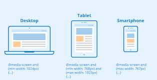
🧩 max-width and max-height:
They’re like the “don’t get too big” rules for your elements — keeping your design responsive and under control.
🧱 What They Do:
-
max-width sets the maximum width an element can grow to.
-
max-height sets the maximum height an element can grow to.
If the content or parent container tries to make the element bigger than that — it stops growing right at that limit.
📘 Example: max-width:
<style>
.box {
width: 100%;
max-width: 600px;
height: 150px;
background: cornflowerblue;
color: white;
text-align: center;
line-height: 150px;
}
</style>
<div class="box">Hello world!</div>
Output:
✅ Here’s what happens:
-
The width: 100% lets it stretch with the browser.
-
But max-width: 600px stops it from becoming wider than 600px — perfect for responsive layouts.
📗 Example: max-height:
.image {
max-height: 400px;
width: auto;
}
If the image is very tall, it’ll shrink down to fit within 400px height while keeping its proportions.
⚙️ When to Use:
| Situation |
Use |
| Responsive images or videos |
max-width: 100%; height: auto; |
| Preventing layout overflow |
max-width: 1200px; |
| Controlling long text boxes or scrollable divs |
max-height: 300px; overflow: auto; |
🧩 The Core Difference Between width & max-width:
| Property |
Meaning |
Behaviour |
| width |
Sets a fixed or relative size |
The element will always try to be that width (no matter the screen size) |
| max-width |
Sets an upper limit |
The element can grow, but never exceed that width(Best for responsive design) |
min-width & min-height:
These are like your element’s safety net on the small side — making sure it never gets too tiny to be usable or readable.
What they do:
-
min-width → sets the minimum width an element can shrink to.
-
min-height → sets the minimum height an element can shrink to.
If the content or parent tries to make the element smaller than these values, the element resists and stays at the minimum.
⚙️ Why Use min-width / min-height:
| Scenario |
Why it's useful |
| Buttons |
Make sure buttons are always clickable on small screens |
| Cards |
Prevent card content from overlapping or collapsing |
| Responsive layout |
Keep readability and aesthetics intact on tiny screens |
| Text containers |
Avoid text wrapping awkwardly or being clipped |